

RETHINKING DIVERSIFICATION
As a financial planner, one of my favorite words is “diversification.” Diversifying a portfolio essentially ensures that we don’t have all of our investment eggs in the same basket. A properly diversified portfolio should experience fewer losses than a non-diversified portfolio as well as benefit from a reduced downside when the market decreases in value. I have a chart that I draw for clients in steps that help me illustrate the purpose and benefits of diversification.
Step one of the chart is to communicate that given enough time, the market has always produced positive returns. (The phrase “enough time” is subjective and fluctuates, but the fact that the market is worth more now than when you were born proves the point.) Thus, given enough time, the market will eventually move from point A to point B:

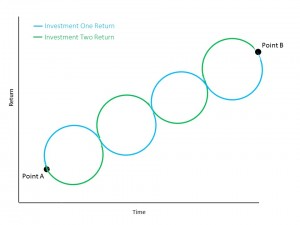
Unfortunately, as we all know, the market doesn’t increase in value at a constant pace. Rather, given enough time, it ebbs and flows while moving in an upward manner:

Armed with this information, what two investments would make up the most consistently performing portfolio? Two assets that ebbed and flowed in a perfectly opposite manner while they ultimately trend upward:
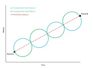
A portfolio of only these two perfectly inversely correlated assets would lead to an incredibly stable and predictable rate of return with virtually no volatility:
Unfortunately, these exact investments don’t exist. However, certain asset categories sometimes (not always!) exhibit this characteristic. For instance, when stocks experience a decline, bonds often benefit as investors sell their equities while their prices are low and buy bonds in what is called a flight to quality. The increased demand for bonds causes the price of the asset to also increase. Thus, an investor who had half his money invested in stocks and half in bonds would likely experience a decrease in the value of the stock portion of his portfolio but an increase in the value of his bond holdings. This would lead to a less dramatic loss when stocks go through a rough patch. Similar relationships can also exist between other asset classes:

Obviously, the more inverse relationships that exist within a portfolio, the less volatility it is likely to experience. This is the true value of diversification.
However, there is a factor that we must return to – that the market and a diversified portfolio only make money when given sufficient time. What happens to a diversified portfolio over shorter periods of time? Does diversification still add value?
One of the implied assumptions in the charts above is that the better performing asset makes more than the worst performing asset loses during any given cycle. For instance, the best performing asset might make +15% while the worst performing category might lose -5%. If this was the case, the portfolio would average a +5% overall return. If this wasn’t the case and the best category returned +10% while the worst asset lost -10%, the portfolio’s performance as a whole would be flat (a return of 0%). Fortunately, investments tend to both make money more frequently than lose money and also make more during the years when they achieve a positive return then they lose during years when they experience a loss.*
Unfortunately, over short periods of time, this is not always the case. In fact, the relationship could be the opposite – the worst performing asset category may lose -15% while the best performing category may only make +5%, resulting in an overall portfolio loss of -5%. As the above charts assume a sufficient amount of time for the market to work, these temporary period of market declines aren’t reflected in the diagrams.
A chart consisting of only the potential disappointing short-term returns of +5% for the best investment and -15% for the worst investment would look something like this:

While the negative short-term results aren’t particularly exciting, the above chart illustrates that diversification adds value even during a bear market. If we had a non-diversified portfolio during a market correction (which would be represented by either the blue or the green line), then there are periods when our portfolio would decrease in value at a much more dramatic pace than our diversified portfolio (represented by the red line).
As this series of charts illustrates, while diversification doesn’t prevent a portfolio from avoiding losses over short periods of time, it does add value to a portfolio during environments of both increasing and decreasing market values. Further, a diversified portfolio is likely to endure both fewer and less drastic periods of short-term losses. All things considered, a diversified portfolio is very likely to produce superior returns over a non-diversified portfolio over an extended time frame.
* Virginia Retirement System study: Since 1926, in years when the S&P 500 increased in value, the average positive annual return was 21.47%. Meanwhile, the average negative annual return in down years was only -14.29%. Further, the market experienced a positive return in 73% of years, and a negative return in only 27% of years.
.svg)